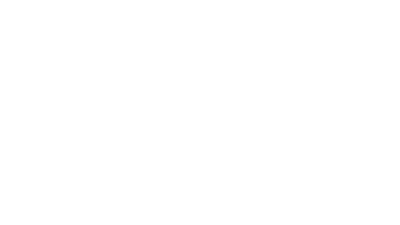
The iconic 20th Century Fox Home Entertainment logo, with its towering letters and dramatic fanfare, is a symbol etched into the annals of entertainment history. It’s more than just a logo; it’s a herald of quality entertainment and a nostalgic touchstone for movie buffs worldwide.
20th Century Fox Home Entertainment Logo
The journey of the 20th Century Fox Home Entertainment logo mirrors the changing landscape of the entertainment industry over the last century. Tracing its transformation reveals more than just a logo adaptation; it demonstrates the evolution of a significant cultural icon.
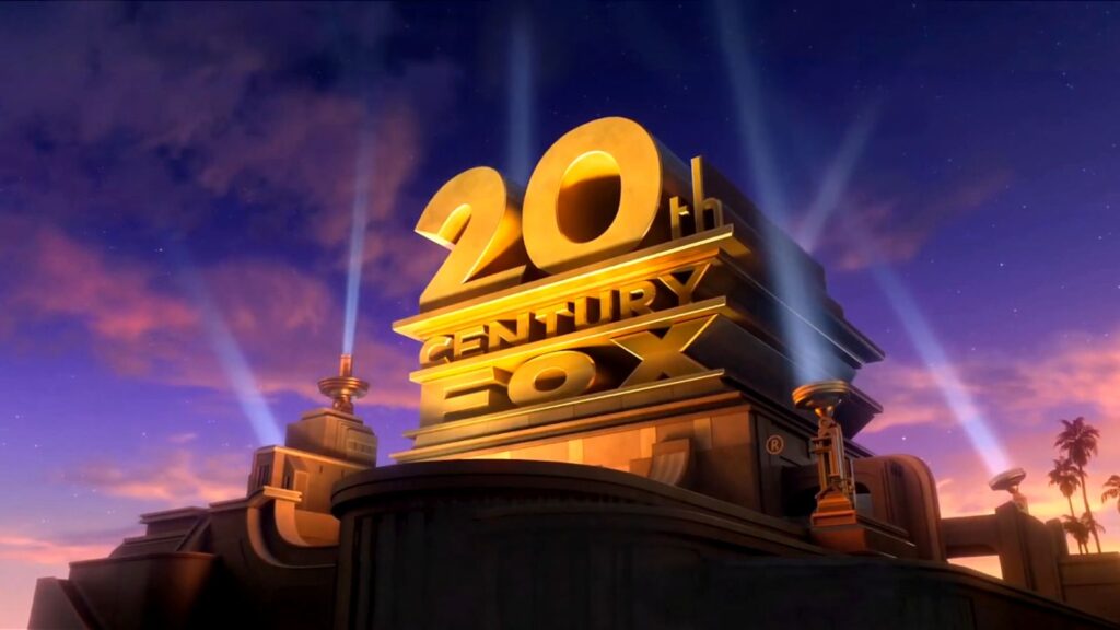
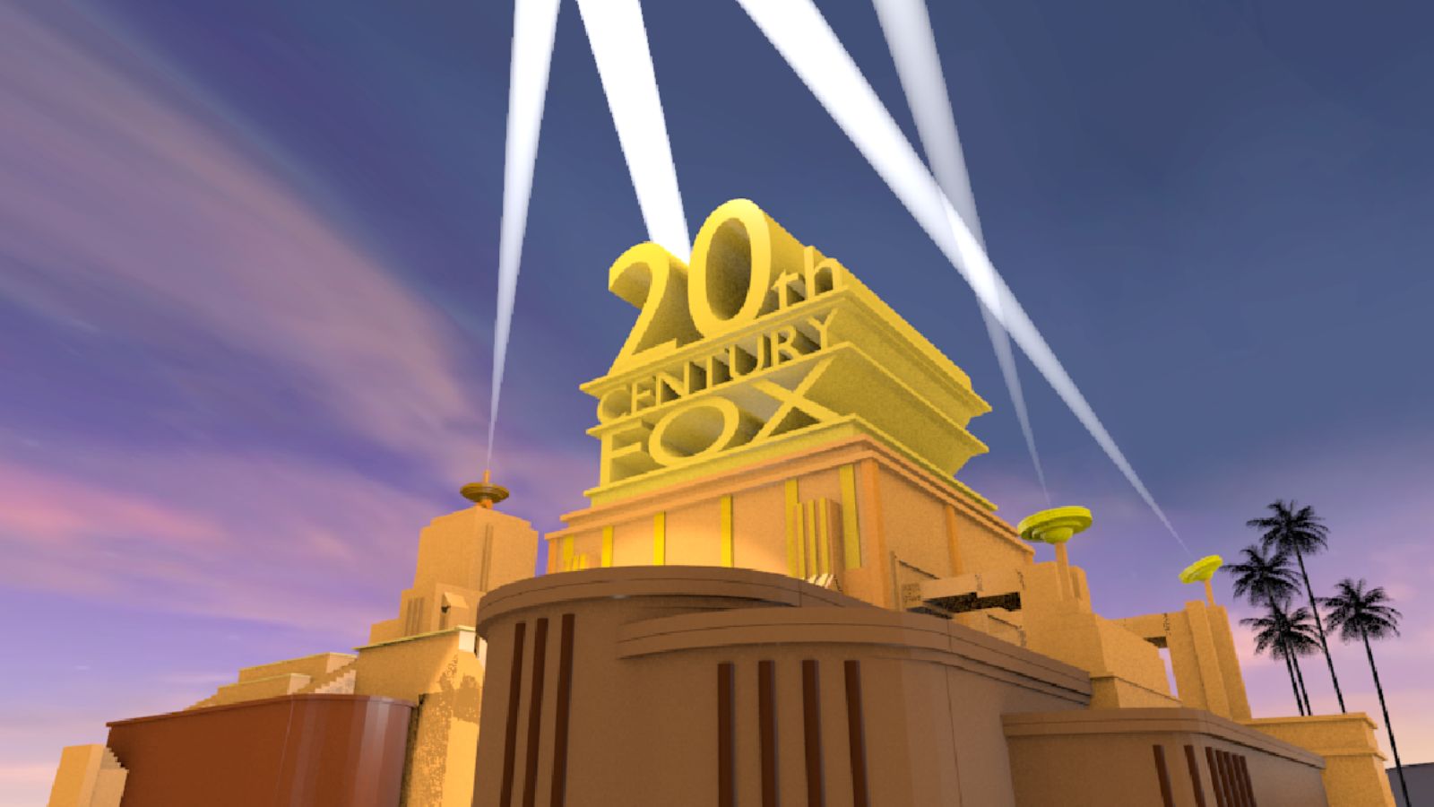
The initial inspiration for the 20th Century Fox logo came almost exclusively from the architectural majestic structures of the Art Deco era. Influenced by the grandeur and glitz of powerful skyscrapers, especially the iconic ones in New York City, this logo was the first to combine 3D theatricality with cinematic elegance in a home entertainment company emblem. As an example, it created a visual identity that was at once a unique brand identifier and an aspirational presentation of Hollywood’s glamour and allure.
Major Redesigns and Their Impact
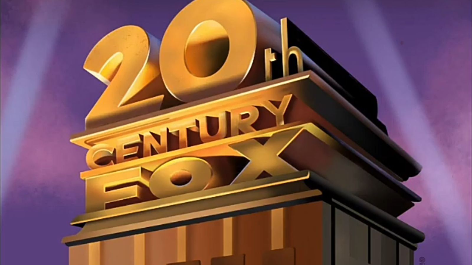
With the advent of new technology and the shift in viewer preferences, the logo underwent numerous significant redesigns. The most notable transformation occurred in 1994, with the logo shifting to a digitized format. This change displayed the company’s adaptiveness, showcasing its readiness to embrace the digital age and new opportunities. As the 20th century drew to a close, the logo’s color palette incorporated more futuristic silver and blue tones, symbolizing the transition into a new era and forecasting the entertainment industry’s progress in the internet-led century.
Even in its latest iterations, the identifiable searchlights remain a key element, anchoring the emblem to its roots while it continually evolves to reflect the forward motion of the company and the industry. Lesser-known modifications, such as the logo’s increased sharpness, help it maintain relevance in an HD-dominated world, subtly indicating the brand’s commitment to delivering high-definition and high-quality content.
Symbolism in the Logo
Iconography and Color Scheme
The predominant iconography of the logo features a 3-dimensional monument with a towering structure emblazoned with “20th Century Fox.” Encased in gold, the form of this edifice reverberates grandiosity and displays the Art Deco style synonymous with early Hollywood. It’s this iconic monument overlaid with strong, broad searchlights animating the night sky, creates a visual spectacle exuding boundless potential and dynamic energy, often associated with cinematic magic.
The color scheme further amplifies the logo’s symbolism. Gold, a dominant hue, associates qualities of wealth, grandeur, and timelessness. It fosters a sense of prestige, mirroring the company’s promise to deliver premier cinematic experiences. The vibrant cobalt blue serves as a background to the golden monument, signifying vastness and limitless opportunities, as represented by the endless expanse of the movie industry.
Cultural Significance
The cultural significance of the 20th Century Fox Home Entertainment logo holds a nostalgic charm. Its dramatic visual sequence triggers a sense of anticipation, a prelude to the cinematic narrative that’s about to unfold. This logo forms part of the collective memories of generations of movie-goers, transformed from a mere brand element to a cultural icon.
Significantly, the Art Deco style of the logo connects audiences to the ‘Golden Age of Hollywood.’ By retaining this element throughout its iterations, the company establishes a link with its illustrious past, while keeping pace with the future, manifesting its dedication to origins and evolution in balance, a testament to its enduring legacy in the ever-evolving entertainment landscape.
What You Need To Know
The 20th Century Fox Home Entertainment logo’s journey from its Art Deco roots to its digital transformation is a testament to the power of branding and innovation. Its evolution has not only maintained the brand’s traditional essence but also embraced the digital age, striking a balance that has significantly enhanced the brand’s identity.